Work/Payman AI
Case study ( 07 ) · Payman
Payman AI: rebranding an agentic banking site for institutional trust.
Payman had agents that move real money and a first screen that read as a friendly startup. Audited the site as a bank buyer, rebuilt the brand around control, and fixed the usability that got in the way.
The Setup
A platform that moves real money, built for a buyer who trusts nothing yet.
Payman AI deploys agents for banks and credit unions that carry out real transactions: payments, transfers and account analysis, inside the institution's own systems.
The buyer is a skeptical, risk-averse bank decision maker. This is my portfolio redesign of paymanai.com. Facts, quotes and the logo come from the live site; the audit, positioning and visual system are mine.
The Tension
The page sold warmth to a buyer who needs proof.
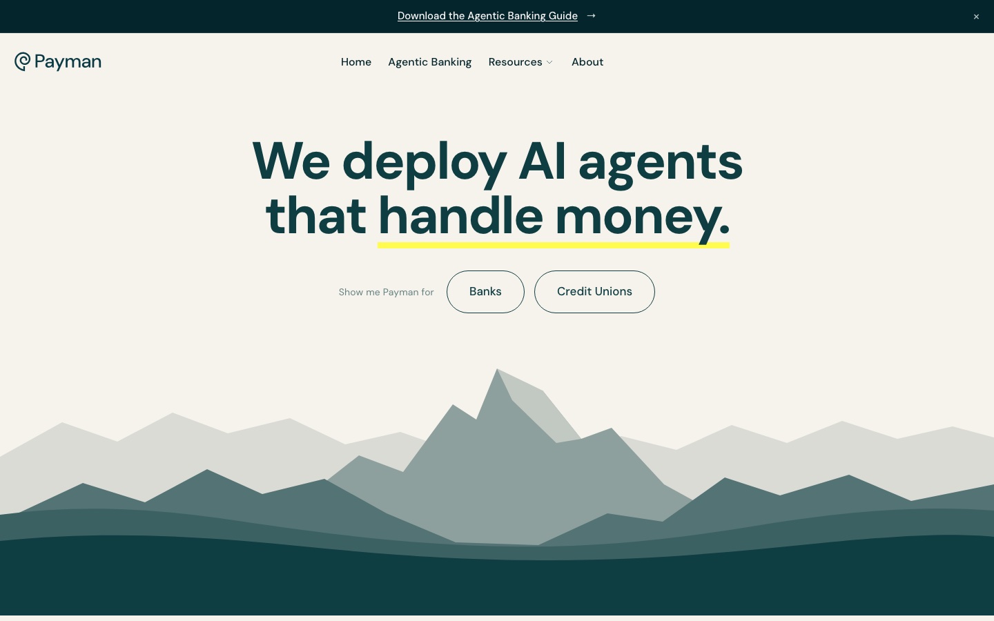
For a bank, capability is the frightening part: an agent that can move money can move it wrongly. The live page answered with warmth: one friendly voice, a decorative mountain, and an announcement bar, a pop-up and a cookie banner in front of the headline.
The job wasn't awareness. It was belief: from “AI will take my customers' questions” to “I can deploy this, and I hold the kill switch.”
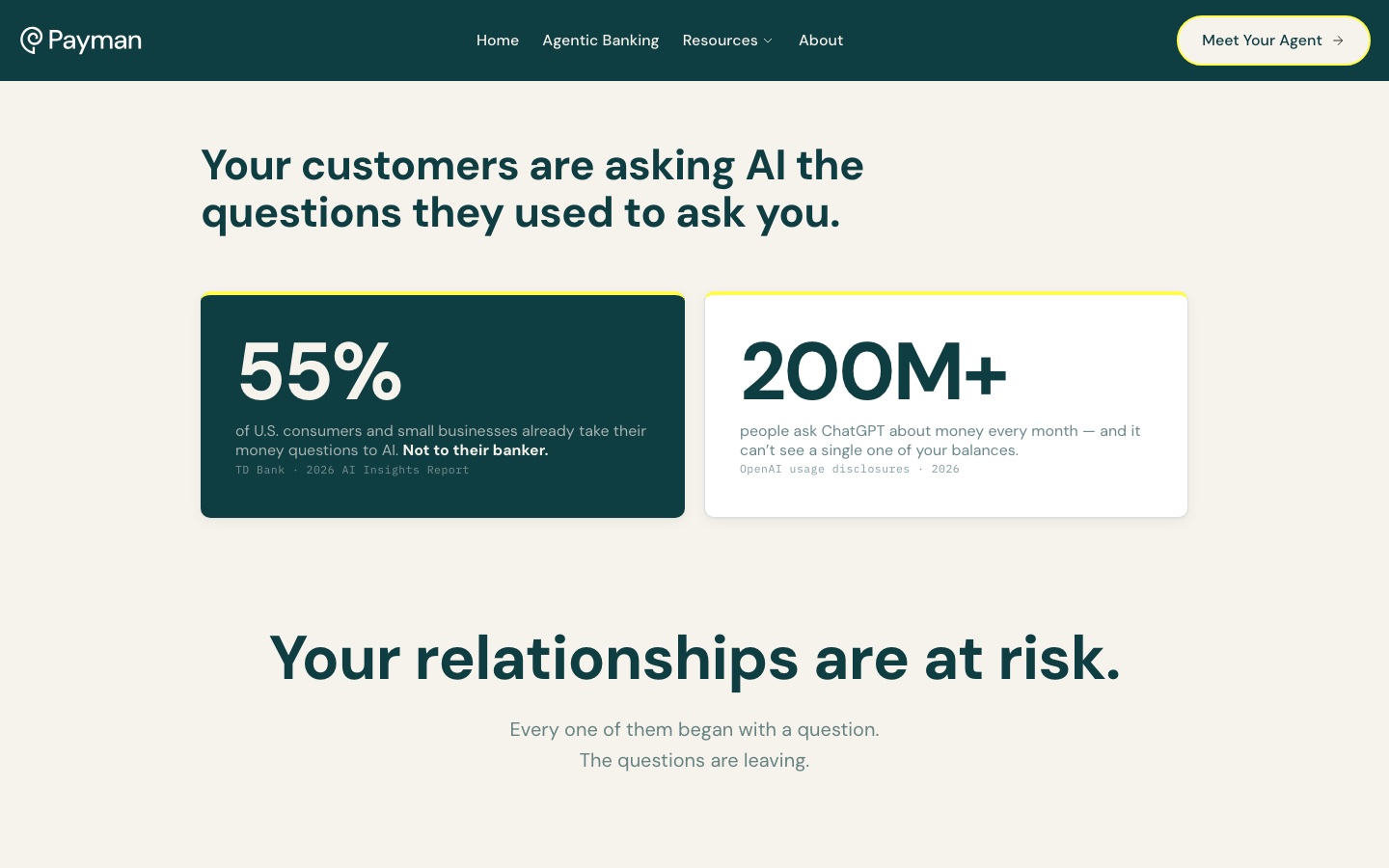
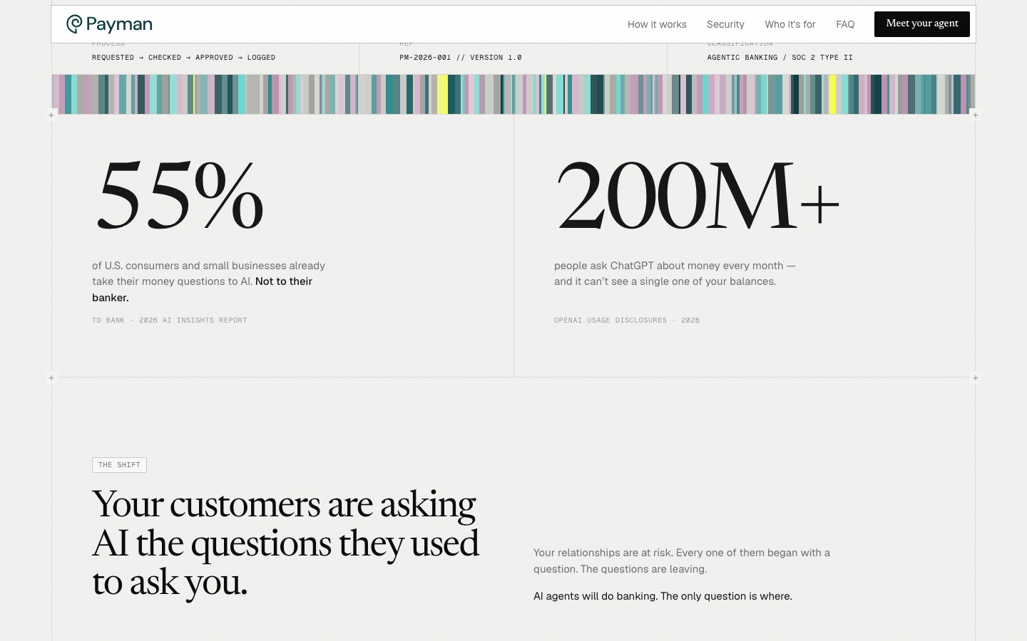
55%
of U.S. consumers and small businesses already take their money questions to AI. TD Bank, 2026 AI Insights Report.
200M+
people ask ChatGPT about money every month, and it can't see a single one of your balances. OpenAI usage disclosures, 2026.
The Decision
Sell the control, not the magic.
Position Payman as the AI you can govern: show the controls, not the intelligence. No hype, no decorative first screen, no pop-ups.
“You set the rules. You see every action.” names what a bank is afraid of and answers it. I audited the live site as a first-time bank buyer and wrote the fix beside every finding.
Audit: what I found, what I did
- What I foundWhat I did
- One friendly voice for everythingTwo voices: a serif for the signed statement, a mono for the system record
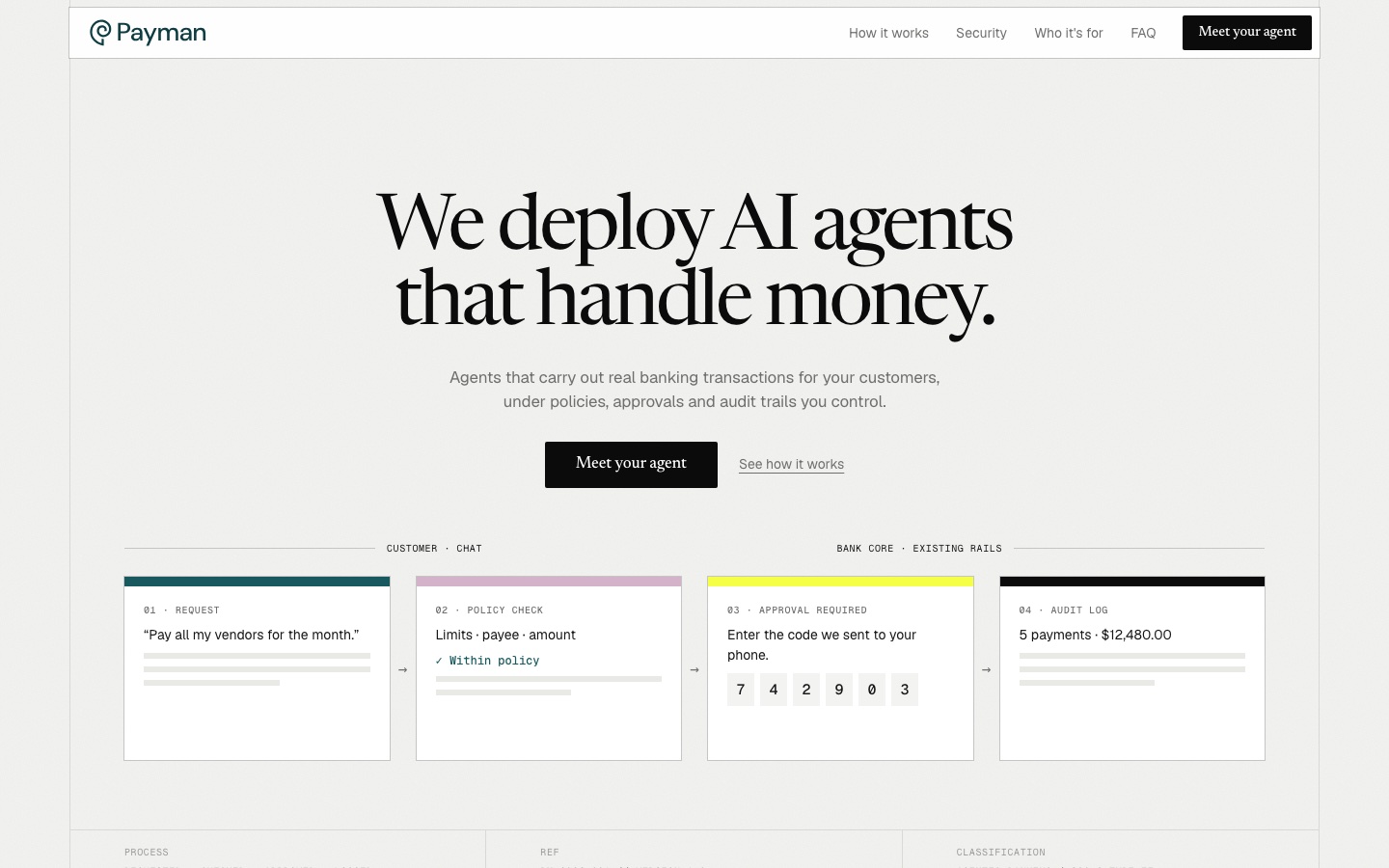
- Decorative mountain art on the first screenThe control process is the hero image: request, policy check, approval, audit log
- Rules, audit trail and kill switch in the last thirdMoved up to the fourth section, on their own teal stage
- Announcement bar, pop-up and cookie banner before the headlineNothing between the visitor and the headline; the pop-up is dropped
- A segment choice instead of an actionOne primary action, “Meet your agent”, in the header and the hero
- Pop-up clips the email field on phonesOne column on phones, form fields at least 44px tall, no overlays
The control process, shown in the hero
- Request
- Policy check
- Approval required
- Audit log
Requested, checked, approved, logged. The same four steps return in the explainer and in the audit log.
The System
A visual identity derived from the positioning, not from taste.
The look follows from the position: paper and ink for the document, deep teal for institutional trust, mauve for warmth, and yellow only as a signal. There is no red, so status reads as confirmation, not alarm.
Three voices, one job each: serif for the signed statement, sans for body, mono for the system record. Every line passes one test: could a compliance officer quote this?
Palette
- Paper#F3F3F0 · Page
- Ink#171717 · Text
- Teal#0E3D42 · Trust
- Mid teal#2F8A8C · Focus
- Mauve#D4B3CA · Warmth
- Signal yellow#F4FF45 · Signal only
Yellow is a bar, a digit or a strip. Never a fill.
Type: three voices, one job each
We deploy AI agents that handle money.
Agents that carry out real banking transactions for your customers, under policies, approvals and audit trails you control.
PM-2026-001 // VERSION 1.0 · REQUESTED → CHECKED → APPROVED → LOGGED
The page, in the order a buyer worries
- Risk
- Control
- Process
- Proof
- Fit
- Reassurance
- Action
Each section answers one question a bank asks before it says yes.
The Impact
The surfaces now match the claim.
Same facts, same viewport, before and after. The first screen now answers the buyer's risk question before it asks for anything.
This is a portfolio redesign: no production metrics, and no tests with real bank buyers. The chat, payments and approval code are illustrative.
Hero, desktop. Drag to compare
 BeforeAfter
The numbers, desktop. Drag to compare
 BeforeAfter
Hero, phone. Drag to compare
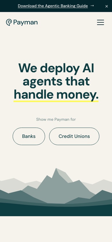
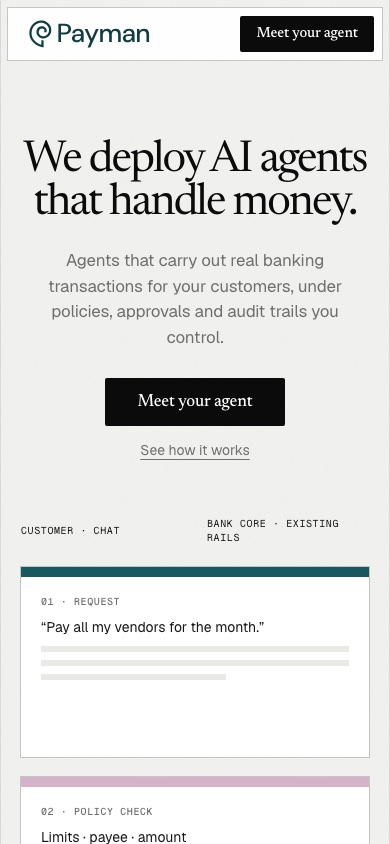 BeforeAfter
Control in the first scroll
The four-step process is the hero image, not an illustration.
One action, everywhere
“Meet your agent” in the header and the hero, from the first pixel.
Nothing in the way
No pop-up, no banner between the visitor and the headline.
The Takeaway
In regulated software, show the control before the capability.
Show the control before the capability. The page works because it opts out of the AI category's vocabulary of magic and warmth and builds its own: paper, hairlines, serif authority, evidence on every screen.
The limits: a free stand-in serif, two text-wordmark logos, and no testing with real bank buyers. Next, I'd see whether compliance leads find the kill switch unprompted.