Model Latency Is a Design Material
Nov 2026Time to first token, streaming cadence, tool-call stalls, and the new loading states agents need.
Why this is on my mind
Classic performance work asks how fast something loads. Working with models, I ask something different: what do we show during the seconds nobody can remove? That's no longer an edge case. It's the core experience.
What's true right now
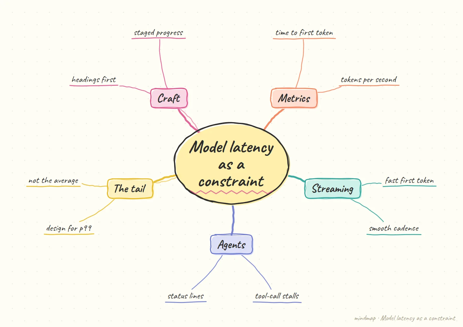
The metrics have names. Time to first token (TTFT) is the gap between sending a request and seeing the first output; time per output token governs how smooth the stream feels. An overview from Redis notes that TTFT directly shapes perceived responsiveness and that perceived TTFT is a design variable teams can shape independently of infrastructure. The same author's UX piece recommends treating latency as a product feature: measure it, budget it, and design around it, and suggests short status lines like "Searching your docs…" when the real answer can't stream yet.
Streaming has limits. One engineer points out that streaming only masks latency after the first token arrives, so if TTFT is three seconds, users still see a blank screen first. He also recommends outputting section headings first for long structured responses, giving users a navigational frame while the body generates, and designing for the p99 case, not the average.
Cadence matters too. A methodology post on streaming UX argues you should measure token cadence and jitter, because users feel bursty streams as lag, and that a good stream updates roughly 5 to 15 times per second. It also calls out a common bug: the model streams but the UI renders markdown only after the full message, making the perceived first output the end of the message.
Agents add a new kind of wait. The same post recommends tracking tool-call stall time as a first-class metric, since tool execution pauses dominate perceived speed in multi-step flows.
What I notice
We have decades of vocabulary for page loads (spinners, skeletons, progress bars). We have almost none for "the agent is waiting on a tool." That state is longer, less predictable, and more varied than a page load, and we're mostly covering it with a pulsing dot.
A worked example of a three-part stall
Illustrative: my own sketch, not a sourced fact.
Take an agent that pauses on a tool. Today the screen shows a pulsing dot. A three-part status might read: "Searching your catalog" (what), "the supplier lookup is slow right now" (why), and a cancel button with the partial results still readable (options). Same wait, but the user knows where they stand. It is also a good test of the design. If a status line cannot answer all three questions, it probably means the team does not yet know what the system is doing during that wait.
The words matter less than the structure. I would not obsess over the exact copy. What matters is that every long stall answers the same three questions in the same order, so people learn the pattern once and stop worrying each time the agent goes quiet. A consistent pattern is easier to build, too. Engineers know what to emit, designers know what to show, and the user stops reading each new message as if it were a surprise.
What I would not trust
My opinion, based on the tradeoffs above.
Status that lies. A progress message that does not match what the system is really doing is worse than a dot. If the status says "reading" while the agent is stuck, the user will notice, and then they stop trusting every future message. Honest and vague beats specific and wrong. And an unhelpful status is not harmless. It uses attention, which is exactly the thing a long wait is already draining, so every line on screen should earn its place or be left out.
Status as a cover for slowness. Good status makes a wait feel shorter, but it does not make the system faster. I would keep an eye on the real numbers, including the p99 case, so the design work does not become a way to avoid fixing a genuine problem. So I would pair any status redesign with a plain measurement of the underlying time. If the perceived speed improves and the real speed does not, that is fine, as long as everyone knows which is which.
My hypothesis
This section is my opinion, not a sourced fact.
Tool-call stalls will become the next standard loading pattern, and the teams that design a clear vocabulary for them will have the products that feel fastest at the same actual speed.
A good stall state answers three questions: what is it doing (searching, reading, running), why is it taking a while (waiting on an external service, processing a large file), and what can I do meanwhile (nothing, keep reading partial results, cancel). Combine that with latency budgets per interaction class (say, instant for acknowledging input, a few seconds for first content, minutes for background tasks with notification) and you've got a design system for time.
I'd treat latency budgets like tokens: named, shared, and enforced.
How I'd test it
Instrument one agent flow for tool-call stalls. Redesign the longest stall with a three-part status (doing, why, options). Compare perceived speed ratings and cancel rates against the original generic indicator.
What would change my mind
If users overwhelmingly ignore detailed status and only care about total time, then status design is wasted effort, and the only lever is making the system faster.
How I would explain latency budgets to a teammate
My opinion, written as a plain-language pitch.
Think of it as a design system for time. We already agree on spacing and color tokens so nobody reinvents them. A latency budget works the same way: a named class such as instant, first content, or background task, each with an agreed behavior. When someone builds a new feature, they pick a class instead of inventing a loading state. The same naming trick works for the handoffs between teams. When someone says a feature needs to feel instant, everyone can point to the same class instead of imagining their own number.
What the budget buys you. It turns arguments about whether a wait is acceptable into a shared reference. A feature either fits its class or it does not. If it does not, the team has a clear choice: make it faster, change the class, or design a better stall state. That is a much easier conversation. It also gives you a way to say no. A new feature that cannot meet its class is not automatically blocked, but it has to come with an explicit plan, and that plan is easier to review than a vague hope.