Design the Worst of Ten: Designing for Non-Deterministic Systems
Nov 2026What the AI guidebooks say, what changes when the same input gives different outputs, and a review habit I want to adopt.
Why this is on my mind
I'm building an AI workflow product for fashion and creative commerce. The first time I ran the same request five times and got five different results, I realized my design reviews were broken. I'd been reviewing a single output, as if it were a mockup.
What's true right now
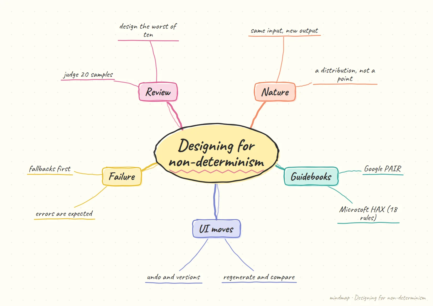
Serious guidance exists. Microsoft Research published 18 guidelines for human-AI interaction in 2019, later turned into the HAX Toolkit with a workbook, design patterns, and a playbook for generating failure scenarios. Google's People + AI Guidebook, from the PAIR team, is organized around six chapters: user needs and defining success, data collection and evaluation, mental models, explainability and trust, feedback and control, and errors and graceful failure.
The unit of design is shifting. An overview of generative UI says the unit of design moves from the screen to the rule set: designers define components, data, and constraints, and the model decides what to render per request. A studio write-up makes the same point from the failure side: fallback design is where products fail, because teams ship generation before they build what happens when the output can't be acted on.
Tail behavior matters more than the average. In writing about latency, one engineer advises tracking p50, p95, and p99 separately and says to alert on p95 and design for p99, because the worst case is the user's impression. The same logic applies to output quality.
What changes
A deterministic feature has one behavior, so you design that behavior. A non-deterministic feature has a distribution of behaviors, so you design the shape of the distribution: the median, and especially the bad tail. Regenerate buttons, side-by-side variations, undo, and version history aren't extras. They're how users sample from the distribution and pick a point they like.
A worked example of reviewing a distribution
Illustrative: my own sketch, not a sourced fact.
Imagine a generate-an-outfit feature. You run one request ten times. Three results are great, five are fine, and two are strange: wrong occasion, clashing pieces, or something that cannot be acted on. A single-mockup review would have shown you one of the great ones and signed it off. The point is not the exact split. It is that a distribution has a shape, and the shape only shows up when you look at many outputs side by side instead of one at a time.
Review the strange two. The useful questions are about those outputs. Can the user see quickly that something is off? Can they regenerate, undo, or step back in one move? If yes, the feature may be shippable. If the strange outputs leave the user stuck, the great ones do not matter, because users will eventually meet a strange one. This is also why the worst of ten is such a useful lens. It does not require a metric or a dashboard, only a willingness to look at the ones nobody put in the demo.
The trade-off underneath
My opinion, based on the tradeoffs above.
Variety and control pull against each other. Regenerate buttons and side-by-side variations give users a lot of choice, but they also hand users the work of sampling. A tighter system hides the spread, but then the user cannot steer it. I do not think there is a right answer, only a deliberate one for each feature. The right setting depends on the feature. A creative tool might want a wide spread because exploring is the whole point, while a task that touches money may want it very narrow.
Spread is a design material. Once you accept the output is a distribution, spread stops being a bug to remove and becomes something you shape. How wide should it be here? Where is narrow better? Those are design questions, and they only appear once you stop reviewing one output at a time. Treating it that way also changes the conversation with engineers. Instead of asking for the model to be better, you can ask for a narrower spread here and a wider one there.
My hypothesis
This section is my opinion, not a sourced fact.
The right design review for an AI feature is to look at the worst of ten outputs, not the best one.
Demos show the best sample. Users experience all of them. If the worst of ten generations is acceptable (or at least safely recoverable), the feature is shippable. If it isn't, no amount of polish on the best case will save it. I'd go further and say that "the p10 output" should be a named quality bar in the design spec, with a defined floor: what must be true of even the worst result.
This also changes who needs to be in the room. The review needs someone to pick adversarial inputs, not just happy-path ones.
How I'd test it
For one feature, generate 10 outputs on each of 10 inputs. Rank each set. Review only the worst from each. Decide whether you'd ship with that. Track how many iterations it takes before the worst-of-ten is acceptable.
What would change my mind
If a good selection layer (ranking or filtering outputs before the user sees them) makes the visible output consistently strong, then the right bar is what survives the filter, not the raw worst case.
What I would do first on a real product
My opinion, a suggested starting order.
Pick the riskiest input. I would not begin with the typical request. I would begin with the input I am most afraid of, the one a user might type on a bad day, and run it ten times. What comes back tells me more about the feature than a hundred happy-path runs. That is a deliberately small first step. It needs no new tooling, only a handful of awkward inputs, a few minutes of patience, and someone willing to look at what comes back without flinching.
Write down the floor. Next, I would put a sentence in the spec for what must be true of even the worst result. It does not need to be fancy. Once it is written down, designers, engineers, and anyone reviewing have the same bar to argue about, and the argument becomes concrete. It also gives the team something to improve against. If the floor changes, you can see it change, and you can tell the difference between polishing the best case and actually raising the worst one.
References
- Microsoft, HAX Toolkit: about
- Microsoft Research, Guidelines for Human-AI Interaction
- Google PAIR, People + AI Guidebook (overview)
- Lazarev.agency, 6 generative UI design patterns behind real products
- Fuselab Creative, Generative UI design
- Tian Pan, TTFT Is the Only Latency Metric Your Users Actually Feel