Trust Your Eyes, Then Write It Down: Optical Alignment
Nov 2026Why a perfectly centered play button looks wrong, and why I think the fix belongs in icon metadata.
Why this is on my mind
Optical alignment is the small detail I notice most when I review AI-generated UI. Everything is mathematically tidy and something still feels slightly off. That feeling is the whole topic.
What's true right now
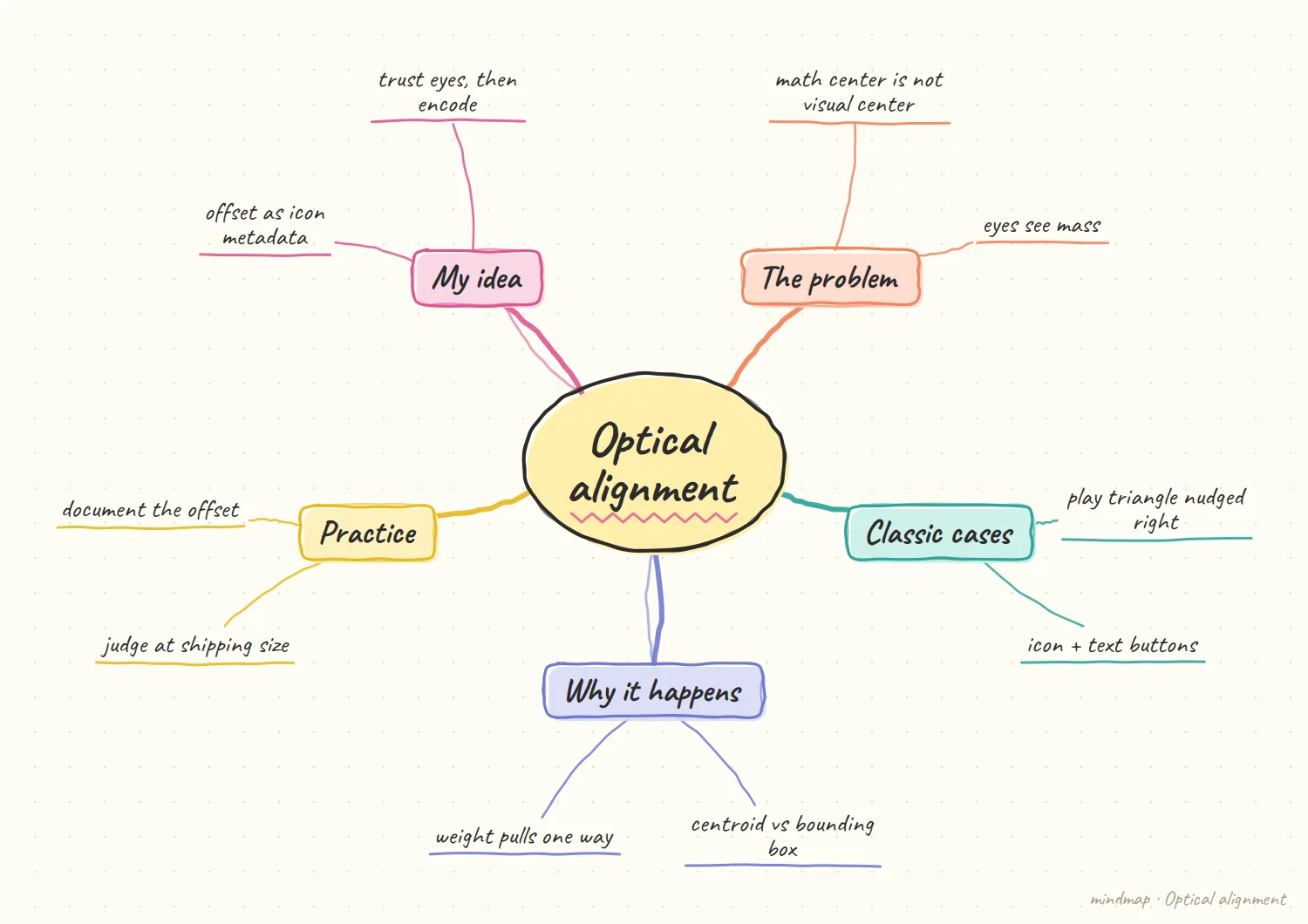
The core idea is simple. Geometric centering uses bounding boxes. Your eye reads visual mass. A play triangle has its heavy flat side on the left, so when its box is centered inside a circle, it looks like it is sliding left. One explainer walks through this with the triangle's centroid: the centroid and the circle's center are different points, and aligning those two is what fixes it. Another gives the rule of thumb: shift in the direction opposite to the visual weight.
It's not only icons. Jakub Krehel's component notes point out that a button with an icon and text often looks better with less padding on the icon side. His "make interfaces feel better" skill lists optical over geometric alignment as a core surface rule, next to shadows, border radius, and hit areas.
Context changes the answer. A practical tip from an icon-library newsletter: judge icons at the size they'll ship, because design tools default to zoom levels where everything looks fine.
People are starting to formalize it. In March 2026 a designer posted on the Figma forum that play icons in YouTube, Spotify, and Apple Music are optically centered rather than mathematically centered, and that they were collecting perception data toward a possible optical-center CSS property and a Figma plugin. It's one post with no replies, so I treat it as a signal, not a trend.
A worked example with a play button
Illustrative: my own sketch, not a sourced fact.
Why the centered one looks wrong. Take a play triangle inside a circle. Center its bounding box and it reads as sliding left, because the heavy flat side sits there and the point is nearly empty. The eye wants the visual mass in the middle, so the triangle has to move toward its point, away from the weight.
Where the fix usually lives. Someone nudges it a pixel or so by feel and moves on. That is the right call in the moment, and it works. The trouble is that the nudge is now a private fact about one component, and the next place the icon appears starts from the centered, wrong version again.
My hypothesis
This section is my opinion, not a sourced fact.
The optical offset should live in the icon's metadata, as a first-class property of the glyph.
Today the fix lives in somebody's head, or in a one-off transform: translateX(1px) buried in a component. That knowledge dies the moment the icon is reused in a new container, or generated into a new layout by a model that has never seen the original design.
If each icon in the library carried its own offset (for example, how far to nudge it inside a circle, and which direction), then any renderer, human or model, gets the right result by default. Optical alignment turns from taste into data. Taste still decides the number. Metadata makes sure it's applied everywhere.
What I would do first on a real product
My opinion, based on the tradeoffs above.
Look at the shipped size first. Before any metadata, I would review the handful of icons that sit inside shapes, at the size they actually ship. Circles, rounded squares and badges are where the mismatch is most visible. A short list of the offenders tells me whether this is a real problem for the product or just a taste preference of mine.
Record the fix where it is made. When a designer adjusts an icon by eye, I would want the number captured at that moment, next to the icon, not in a comment or a chat thread. Capturing it costs seconds. Reconstructing it months later, from a transform buried in a component, is the expensive part.
How I'd test it
Take 30 icons from a real library. Have two designers set optical offsets independently. If their numbers cluster closely, the offsets are stable enough to store. If they scatter, the idea is weaker than I think and each context needs its own call.
What would change my mind
If offsets depend heavily on container shape and size, one number per icon is too coarse, and the metadata would need to become a small function instead of a value.
Where I would not trust this yet
My opinion, based on the tradeoffs above.
Taste does not fully reduce to a number. Two designers may both be right and still disagree by a pixel. I would not want metadata to become a rule that overrides a careful eye in a context it was never tuned for. The offset should be a default that people can override, not a law.
One value may hide a dependency. The right nudge may depend on stroke weight, size or the shape around it. If so, a stored value is correct in one place and subtly wrong in another, which is worse than no value because it looks authoritative. I would flag any offset that has only been checked in one container.
References
- Icons8, Why great designers break alignment rules
- Rails Designer, Mathematical and optical alignment in design
- Jakub Krehel, Optical alignment
- Open Skill Index, make-interfaces-feel-better by Jakub Krehel
- IconBuddy, Why your icons look off
- Figma Forum, Optical centering of icons