AI Needs a Happy Mac: Lessons from Susan Kare
Nov 2026Constraint-born icons, a recent talk, and why I think AI products need a wordless status language.
Why this is on my mind
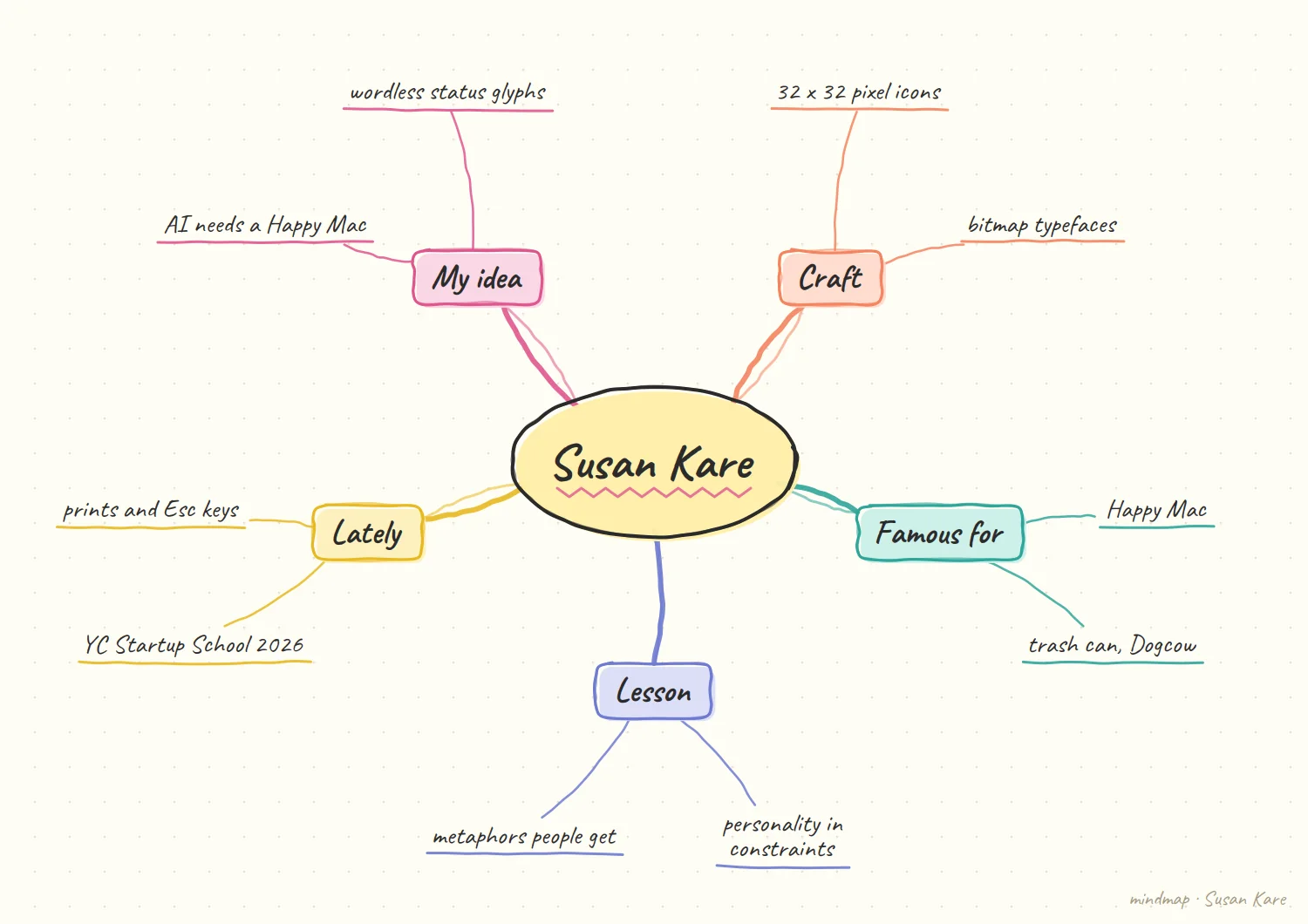
Kare is back in the conversation: she spoke at Y Combinator's Startup School 2026, and the talk is now on YC's channel. As someone who designs interfaces for AI workflows, I keep returning to how much emotion she packed into a handful of pixels.
What's true right now
She is still active. 9to5Mac reports Kare spoke at Startup School 2026 and that several of her original ideas for the first Macintosh survive in macOS, either in spirit or literally. Her work lives on in the world too: she sells signed prints of the original icons and has sold keycaps and pendants in her bitmap style, as covered by AppleInsider. The Esc Keys collection features 32 icons, per Macworld.
The craft was constraint. Her best-known icons are 32-by-32-pixel graphics for the Macintosh. MoMA holds her 1982 sketchbook for the Macintosh icons and describes them as making the interface between humans and machines easier and friendlier in tone. She refined the trash can from an earlier one on Apple's Lisa, and she has said the Happy Mac was meant to tell the user that everything was fine, per CoolCuration's profile.
Icon detail still gets argued about. Apple's macOS 27 reportedly dropped the small icons from Finder menus again after criticism, according to a June 2026 item on iFun.de. Whatever you think of that call, it shows icons are still a live design debate, not a solved one.
What I take from it
The Happy Mac is a status indicator. It answers one question without a word: is the machine okay? That's a single bit of reassurance, delivered with personality, at a moment of maximum anxiety (boot). Every AI product has the same moment, over and over: is the model working, thinking, stuck, or wrong?
Right now we answer that question with a spinner, a sentence, or a stream of text. That's the equivalent of explaining the Happy Mac in a paragraph.
A glyph set I would sketch first
Illustrative: my own sketch, not a sourced fact.
Start from the questions, not the shapes. For each of the six states, I would write down the one question the user is silently asking. Working: is it doing something? Unsure: should I trust this? Needs your input: is it waiting on me? Only then would I draw anything. A glyph that cannot be tied to a question is decoration. It sounds slow, but it saves time, because the questions double as the brief for anyone who joins the work later and needs to know why a glyph exists.
Draw small on purpose. Following the constraint idea, I would draw at a tiny size first and only scale up if a shape survives. Color-free is the second filter. If two states look alike in a single tone, one of them needs a different silhouette, not a different hue. That discipline is the part I most want to borrow. The tiny grid was not a limitation she worked around, it was the thing that made each decision visible.
Where a glyph is the wrong tool
My opinion, based on the tradeoffs above.
Abstract states. The Happy Mac worked because its message was simple and universal. Some AI states are not. The difference between unsure and stuck can be subtle, and a glyph that tries to carry both may carry neither. If I cannot describe the difference in one short phrase, I doubt a picture will do better. I would not claim this settles it. It is a prompt to test, and the labelled-versus-unlabelled comparison in the test above is what should decide it.
Personality has a limit. A little warmth at boot is charming. Warmth next to a failure can read as the product not taking the problem seriously. I would give the failure-adjacent states the plainest drawing in the set and save the character for the states where nothing is wrong. It is a lesson I would apply to any new state, too. If a state cannot be told apart from its neighbour without a caption, the caption is probably doing the real work.
My hypothesis
This section is my opinion, not a sourced fact.
AI products need their own small, wordless, trustworthy glyph vocabulary for model state, and whoever designs it well will set the standard the way Kare did.
I'm thinking of four to six states: working, confident, unsure, needs your input, stuck, and done. Each should be recognizable at a glance, readable at 16 pixels, work without color, and carry a little personality without being cute about failure. Constraints help, as Kare showed: a tiny grid forces clarity.
The reason this matters now is that generated interfaces will be everywhere, and users will need a stable visual language to tell what the system is doing across products.
How I'd test it
Show participants eight candidate glyphs for the six states with no labels. Measure recognition accuracy and speed. Any glyph under 80% recognition goes back to the drawing board.
What would change my mind
If users prefer plain text labels over glyphs for AI status (because the states are too abstract for icons), then words win and the vocabulary should be a style guide for phrases instead.
How I would explain it to a teammate
My opinion, a way of pitching the idea rather than a sourced claim.
Start with the spinner. I would ask them what a spinner actually says. Mostly it says only that something is happening, which is the least useful thing to know. Then I would ask what they would want to know instead, and let the list of states come from them. None of this is a ruling against glyphs. It is a reason to treat each state on its merits, and to be ready to write a phrase when a picture will not carry it.
Frame it as a small system. The pitch is not an icon pack. It is a short vocabulary with rules, the way a type scale is. If the team can agree that six states cover most moments, the drawing becomes the easy part, and the argument about words versus glyphs can be settled by the test above. It also gives the glyph set a clear job description. Reassure when things are fine, be plain when they are not, and never ask a small picture to explain a complicated failure.
References
- 9to5Mac, Watch Susan Kare revisit the icons and graphics for the original Mac
- MoMA, Susan Kare, Apple Macintosh OS icon sketchbook, 1982
- CoolCuration, Susan Kare profile
- AppleInsider, Susan Kare's Esc keys
- Macworld, The original Mac icon artist is selling a set of adorable silver and gold keycaps
- iFun.de, Symbole (Susan Kare and macOS 27 Finder menus)