Honest by Design: What Dieter Rams Gets Right About AI Interfaces
Nov 2026The ten principles, the documentary, and the one principle I think AI products need most.
Why this is on my mind
Every few months someone quotes "less, but better" in a deck about AI. I wanted to go back to what Rams actually wrote and ask which principle holds up when the product is a probabilistic system.
What's true right now
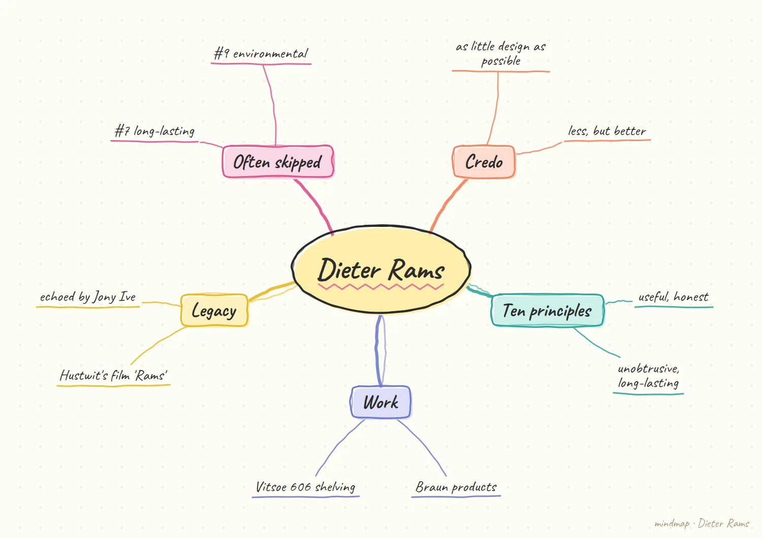
The principles are criteria, not rules. Rams was a long-time head of design at Braun and worked with Vitsœ on furniture. He asked himself whether his own work was good design, and his answer became the ten principles, intended as criteria for judgment rather than rules. Vitsœ publishes the list: good design is innovative, useful, aesthetic, understandable, unobtrusive, honest, long-lasting, thorough down to the last detail, environmentally friendly, and as little design as possible. Rams codified them in the late 1970s, according to Dezeen's coverage of the documentary, and the 1995 book Less but Better lays out the philosophy more fully, as summarized by CRM.
The documentary reframed the legend. Gary Hustwit's film Rams runs 73 minutes and includes voices like Braun colleague Dietrich Lubs, Vitsœ's Mark Adams, and designer Naoto Fukasawa, per Metropolis. Hustwit has said he wanted to get past the legend. The film also lands on an uncomfortable point: Metropolis observes that admirers tend to gloss over principle seven (long-lasting) and principle nine (environmentally friendly).
Rams is skeptical of digitization. A film review notes that at 86, he did not use a computer and questioned digitization's effects on people and its empowerment of consumerism. That's a strange, valuable position to read while building software.
The principle I'd pull forward
Principle six: good design is honest. For a physical product, that's about not pretending to be more than it is. For an AI product, it's the whole game. An interface that sounds equally sure when it's right and when it's guessing is dishonest in exactly Rams's sense. Principle ten, as little design as possible, then follows: if the system is honest about what it knows, it doesn't need decoration to compensate.
What honesty looks like on a screen
Illustrative: my own sketch, not a sourced fact.
A hypothetical answer. Imagine an assistant that summarizes a long document. In one version, every sentence arrives in the same flat, certain voice. In another, the parts it is sure of read plainly, and the parts it inferred are marked as inferred. Both versions look equally tidy. Only one of them tells the user where to look twice, and that difference is what I mean by honest in Rams's sense. It is a small example, and I would not lean on it too hard. Its only job is to make the idea concrete enough to argue about with a teammate.
Why this is about the interface, not the model. The model may produce the same words either way. The honesty lives in what the screen does with them: phrasing, emphasis, a visible hedge, a prompt to check. That makes it a design decision, and it means a designer can improve it without touching the model at all. That is also why I find it a hopeful framing. A designer can act on it this week, with the tools already in hand, instead of waiting for a better model to arrive.
Where this principle pulls against the others
My opinion, based on the principles as listed above.
Honest versus unobtrusive. Principle five says good design is unobtrusive. Principle six says it is honest. An interface that flags every uncertain sentence is honest and also noisy. I do not think there is a clean answer here, only a trade-off: show uncertainty where it changes what the user will do, and stay quiet where it would not. I would still say out loud that this is a judgment call. The principles were criteria for weighing a design, and that is how I want to use this one too.
Honest versus understandable. Expressing confidence well also has to be readable. If the hedging vocabulary is too subtle, nobody notices it. If it is too elaborate, nobody learns it. I would rather start with two or three clearly different states than a continuous scale that looks precise and means nothing to the person reading it. If I am honest, I may be underrating how often the two pull together. A product that is truly honest about its limits tends to need less chrome, which helps both principles at once.
My hypothesis
This section is my opinion, not a sourced fact.
Honesty will be the dominant design principle for AI products, and it will be measurable.
I mean concretely: a product's honesty can be scored by whether its expressed confidence matches its actual accuracy. A response that sounds certain and is right 60% of the time is dishonest design. One that visibly hedges where it should and commits where it can is honest design. We can run that as an evaluation, not just a vibe.
If that's right, the principle that matters most in 1978 and the principle that matters most in 2026 turn out to be the same one, and it's the one most AI interfaces currently break.
How I'd test it
Collect 100 outputs from an AI feature. Rate the interface's expressed confidence on a scale, then compare against whether the output was actually correct. Plot it. The gap is your honesty debt.
What would change my mind
If users consistently prefer confident-sounding interfaces even when told they're less accurate, honesty may lose to preference in the market, even if it wins on principle.
What I would do first on a real product
My opinion, a sketch of a first step rather than a method I have run.
Look for the uniform voice. Before redesigning anything, I would read a batch of real outputs and ask one question: does the interface sound any different when the system is guessing? If the answer is no, that is the first thing to fix, because everything else sits on top of it. The point of writing it down is that the first version of this trade-off will probably be wrong. I would rather have a stated rule I can revise than an unspoken habit nobody can question.
Then change one place, not all of them. I would pick the single screen where a wrong answer costs the user the most and make confidence visible there first. It is easier to defend a small change with a clear reason than a system-wide restyle, and it gives me something concrete to measure against the test described above. A narrow first step also keeps the work honest. If it does not help on one screen, I have learned something cheaply, and nothing else in the product has been disturbed.
References
- Vitsœ, Good design at Vitsœ
- Design Explained, Dieter Rams and ten principles for good design
- CRM, Less but Better: Dieter Rams' 10 principles
- Metropolis, New Documentary Provides a Portrait of Design Superstar Dieter Rams
- Dezeen, Trailers reveal snippets of upcoming Dieter Rams documentary
- ArtsFuse, Film Review: A Compelling Look at Dieter Rams