OKLCH: The First Color Space Designers and Machines Agree On
Nov 2026Perceptual color, Tailwind v4, and why I think brand palettes are about to be computed instead of picked.
Why this is on my mind
In fashion and creative commerce, color is the product. A garment's color has to look right next to the page around it, in light mode and dark mode, on different screens. That is exactly the problem OKLCH was built to make less painful.
What's true right now
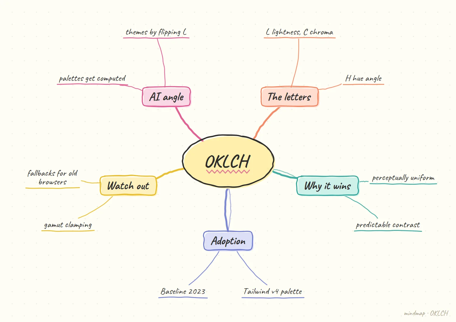
It's a perceptual model. OKLCH describes color as lightness, chroma, and hue, and is part of CSS Color Level 4. Its practical promise is that the numbers behave the way your eye does: change hue and keep lightness, and the color stays about as bright. That is why contrast checks and palette ramps become predictable. A converter page notes it can represent colors outside the sRGB gamut, which get clamped for display.
It's mainstream. Tailwind CSS v4 rebuilt its default palette in OKLCH. One side effect is that familiar swatches shifted: red-500 moved from #ef4444 to #fb2c36 even though the name stayed the same. Jakub Krehel's OKLCH skill for coding agents describes the format as Baseline 2023 with roughly 96% global coverage. The token standard agrees: the W3C Design Tokens spec supports Display P3, OKLCH, and the other CSS Color 4 spaces.
It's not free. A frontend checklist lists support as Chrome 111+, Firefox 113+, and Safari 15.4+, and recommends an HSL fallback for older browsers. A Hugo community thread shows the real-world version of that tradeoff: someone hit Tailwind v4's lack of an OKLCH fallback, checked analytics, found under 5% of their users were affected, and went ahead.
Dark mode can be derived. The OKLCH skill suggests deriving a dark palette by reversing the lightness mapping from the light one instead of hand-picking colors. That only works because lightness is a trustworthy axis.
What a ramp rule looks like
Illustrative: my own sketch, not a sourced fact.
One hero, one rule. Say the brand color is a mid-lightness green. The rule is a short list: step lightness by a fixed amount per stop, ease chroma down as colors get very light or very dark, and never move hue. Every tint, shade, hover and disabled state is then a calculation, not a decision someone has to remember to make.
Why a rule beats a palette. A hand-built ramp records the answers but not the reasoning. When the brand shifts, the whole ramp has to be redone by eye. A rule keeps the reasoning, so it can be rerun.
My hypothesis
This section is my opinion, not a sourced fact.
Within two years, a brand color will be specified as an OKLCH value plus a lightness-ramp rule, not as a hand-built hex palette, and AI theming tools will converge on that.
Why: models are good at arithmetic and bad at "that blue feels right." OKLCH turns taste into numbers a model can manipulate without ruining the color. Give it one hero color and a rule for how lightness steps across a scale, and it can generate light mode, dark mode, hover states, and disabled states that all stay on-brand.
The catch is that brand teams will need to own the rule, not just the color. The hero shade is a decision. The ramp is a policy. Whoever writes the policy controls every generated surface.
How I'd test it
Take one brand color. Build dark mode two ways: hand-picked, and derived by flipping the lightness ramp. Count contrast failures and "this looks off" flags from a second designer. If derived mode wins or ties, I'd move the whole system over.
What would change my mind
If wide-gamut colors keep getting clamped in ways that visibly dull brand hues, a brand-critical palette may still need hand tuning per display class.
Where I would not trust it yet
My opinion, based on the tradeoffs above.
Wide-gamut hues. A vivid brand color can fall outside what a display can show, and clamping can quietly dull it. For a brand-critical hero shade I would still check it by eye on a few real screens.
Old browsers. If a meaningful share of users cannot read OKLCH, the fallback is a second source of truth to keep in sync. That cost is real, and it is the first thing I would measure.
References
- ToolsBase, OKLCH Converter & Accessible Palette Generator
- ColorKit, Tailwind CSS Colors (what changed in v4)
- UI Skills, better-colors skill by Jakub Krehel
- Skillselion, oklch-skill
- W3C Design Tokens Community Group, stable version announcement
- Frontend Checklist, Use OKLCH for color tokens
- Hugo Discourse, Should a warning be added on the Tailwind docs about browser support?